Digital Craftsmanship That Converts Users Into Customers
In today's competitive landscape, exceptional user experience is no longer a luxury – it's a necessity. Kindred Code designs intuitive, beautiful interfaces that don't just look good; they drive engagement, satisfaction, and measurable business growth.
Increased conversions and revenue
Delighted users and enhanced brand loyalty
Clear brand differentiation in a crowded market
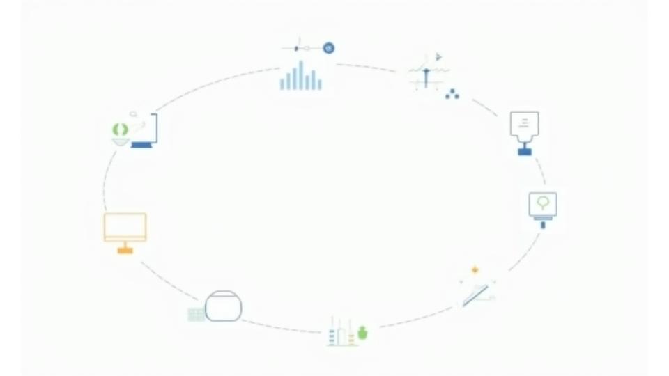
Our Research-Driven Design Process
User Research & Empathy Mapping
Deeply understanding your audience's needs, behaviors, and pain points through quantitative and qualitative research to inform every design decision.
Information Architecture & Wireframing
Crafting intuitive structural blueprints and navigation systems for optimal user flows that guide users effortlessly to their goals.
Visual Design & Prototyping
Bringing concepts to life with stunning visual interfaces, aligned with your brand identity, and interactive prototypes for dynamic user testing.
Usability Testing & Iteration
Rigorously testing designs with real users to identify friction points, gather feedback, and iterate towards perfection.
Design Systems & Handoff
Building scalable design systems and providing crystal-clear documentation for seamless developer handoff and future consistency.
Comprehensive Design Services
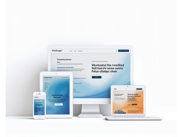
Web Design & Engineering
Crafting responsive, engaging websites that deliver exceptional user experiences and drive conversions across all devices.
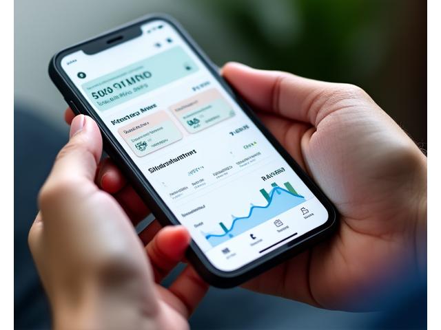
Mobile App Design (iOS & Android)
Designing intuitive and beautiful mobile interfaces that ensure a delightful experience for users on both iOS and Android platforms.
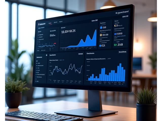
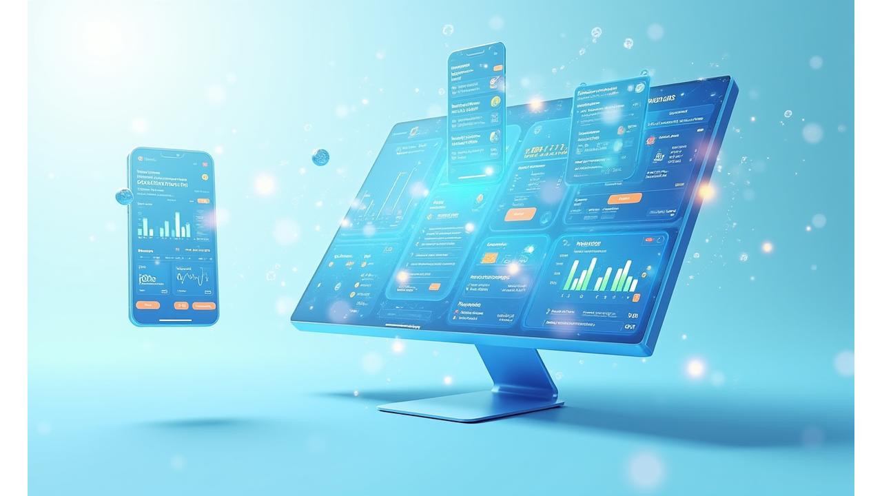
Dashboard & Data Visualization
Transforming complex data into clear, actionable insights through expertly designed dashboards and impactful data visualizations.
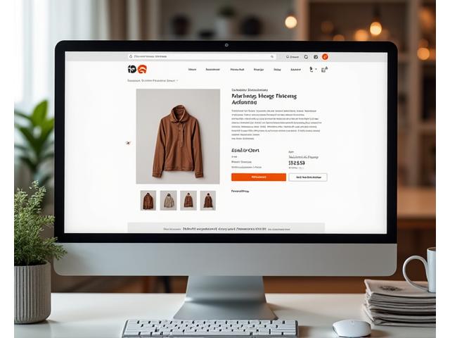
E-commerce Experience Design
Building engaging and conversion-optimized online shopping experiences that captivate customers and maximize sales.
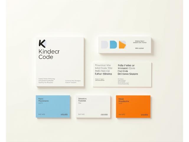
Brand Identity & Visual Systems
Developing cohesive brand identities and visual systems that resonate with your audience and reinforce your unique market position.
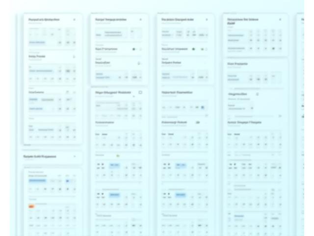
Design Systems & Component Libraries
Creating robust, scalable design systems and component libraries to ensure consistency, efficiency, and future-proof digital products.
Design That Drives Business Results
At Kindred Code, design is not just about aesthetics; it's a powerful tool for achieving your business objectives. We focus on conversion, user retention, and measurable impact.
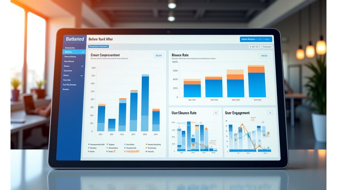
Conversion Rate Optimization
Strategic design improvements informed by data to maximize your key conversion metrics.
A/B Testing Methodology
Data-driven design decisions, meticulously tested to ensure optimal performance and user preference.
User Journey Optimization
Streamlining user paths, reducing friction, and eliminating abandonment points across your digital ecosystem.
Award-Winning Design Portfolio
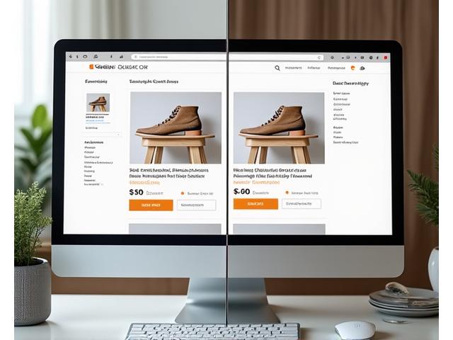
E-commerce Redesign: +65% Conversion
Transformed an outdated online store into a conversion powerhouse, resulting in a 65% increase in purchase rates.
View Case Study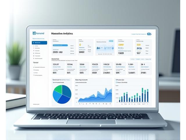
SaaS Dashboard: Enhanced Engagement
Designed an intuitive SaaS dashboard that significantly improved user engagement and reduced churn for a B2B platform.
View Case Study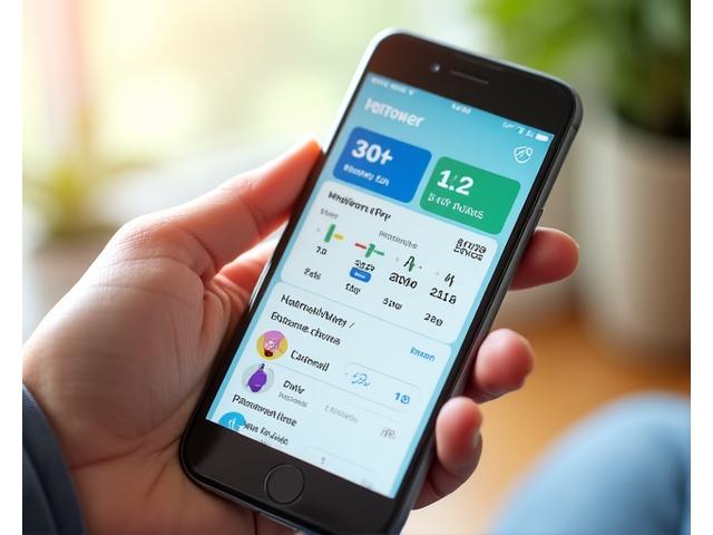
Mobile App Design: 4.8+ App Store Rating
Crafted a highly-rated mobile application that garnered widespread user acclaim and exceptional store reviews.
View Case StudyModern Design Tools and Technologies
We leverage the industry's leading tools and platforms to ensure efficiency, precision, and seamless collaboration throughout your project.
Accessible Design for Everyone
Inclusivity is at the heart of exceptional design. We ensure your digital products are accessible to all users, adhering to the highest global standards.
WCAG 2.1 AA Compliance
Meeting and exceeding global accessibility standards for a truly inclusive experience.
Optimized Color Contrast
Ensuring visual elements are discernible for users with varying visual abilities.
Keyboard Navigation
Seamless navigation and interaction for users relying on keyboard-only input.
Screen Reader Compatibility
Crafting experiences that are fully understandable and navigable for screen reader users.

Transform Your Digital Experience Today
Ready to elevate your product with world-class UI/UX design? Let's discuss your vision and unlock new possibilities for your users and your business.
Claim Your Free UX Audit & Consultation
Get a complimentary analysis of your current digital product's user experience, identifying key areas for improvement and competitive advantage.